Stylistically, you could call Gambarino a post-modern interpretation of the Garalde genre. It is different enough from most serif typefaces designed for text that you could combine it with another Garalde easily; that other font would set the body text, while Gambarino would shine in the headlines.
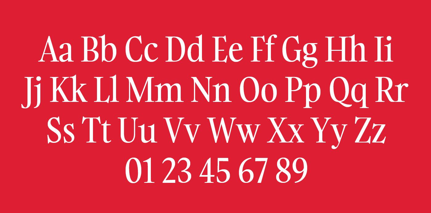
Gambarino’s serifs are exquisitely fine; they are paired with teardrop terminals. The capital letters are top-heavy; the bowls and counterforms in the upper portions of each letter are larger than the lower ones. Gambarino’s lowercase features a tall x-height, and what can only be described as ‘microscopic’ descenders. The descenders are all much shorter than the font’s ascenders, and this is visible everywhere except in the ‘g’, which employs a great trick in its design to keep the sizes of its two bowls balanced.
Gambarino’s serifs are exquisitely fine; they are paired with teardrop terminals. The capital letters are top-heavy; the bowls and counterforms in the upper portions of each letter are larger than the lower ones. Gambarino’s lowercase features a tall x-height, and what can only be described as ‘microscopic’ descenders. The descenders are all much shorter than the font’s ascenders, and this is visible everywhere except in the ‘g’, which employs a great trick in its design to keep the sizes of its two bowls balanced.